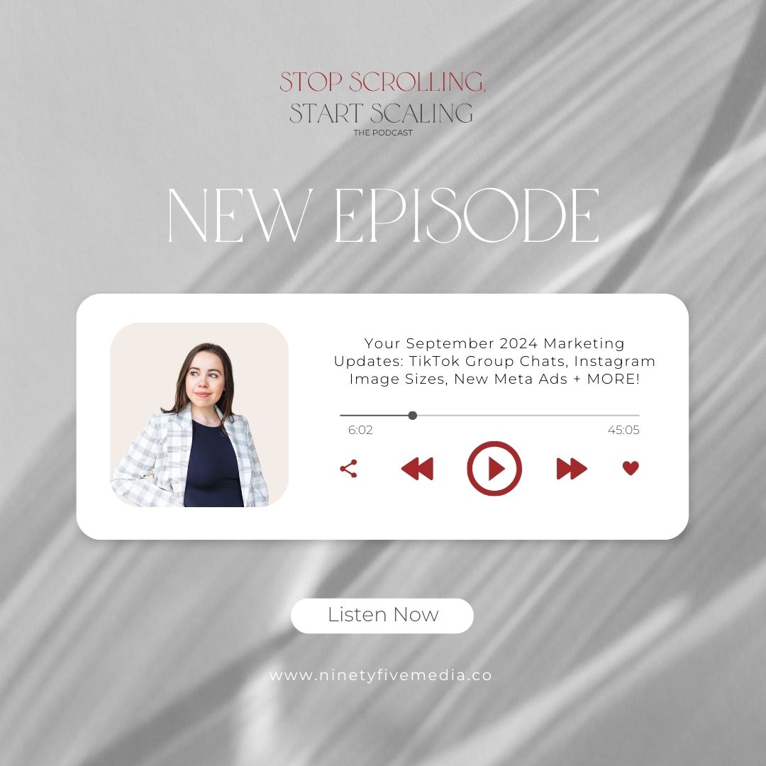
On today’s episode, Emma is bringing you the latest can’t-miss developments from across the social media marketing world. She’ll explain how to leverage Instagram’s new, expanded carousel posts, and share her thoughts about TikTok’s new cover thumbnails and group chat feature. Emma also dives into how to use Meta’s innovative ad updates to boost your business’s visibility. As always, she breaks down how these changes can impact your business and provides actionable tips to stay ahead of the curve. Plus, a bonus Instagram profile update that you need to know about! Tune in to ensure your marketing strategies are on point this month.
Listen in as we speak about:
- How to leverage Instagram’s new 20-frame carousels to enhance your brand’s storytelling
- Curating your TikTok aesthetic with cover thumbnails (and whether that’s a good thing!)
- Integrating website offers into your Meta ads to increase traffic and conversions
And much, much more!
Curated Cover Thumbnails on TikTok
Emma breaks down TikTok’s new cover thumbnail feature, which allows users to upload custom cover images for their videos, a shift from the previous option of selecting a frame from the video itself. This update offers creators like you more control over your profile’s aesthetic, enabling you to craft a more polished and engaging presence. But is this a good thing? Emma explains what a departure this is from the platform’s raw, unfiltered vibe, and the impact it could have on how brands and influencers use TikTok going forward.
Meta’s Ad Integration Update
Emma explains how Meta’s latest ad update allows users to automatically integrate website offers into their ads, streamlining the promotion process. This means that if you’re running a site-wide promo, your promo will automatically appear in your ads without any extra setup. Emma describes how this feature could not only save time but also increase the relevance of your ads, potentially driving more traffic and boosting sales by aligning your ad content with your current promotions.
Surprise: Instagram’s New Profile Layout
Instagram dropped a big update this month that no one is talking about! Emma describes how the platform has shifted from its traditional square grid layout to a new rectangular format. This change means that creators must adapt their content to fit the new dimensions, ensuring that nothing gets cut off and that feeds continue to look professional and cohesive. Emma breaks down how this new format can be a plus for your business, as it allows you to take up more space in feeds and potentially hold users’ attention longer as they scroll through your content.
Connect with Ninety Five Media:
Need Support with Your Podcast? We’ve got you covered
Book a Strategy Intensive Call with Emma for a custom marketing plan for your brand: strategyintensivecall.co
Book a call to explore our social media management services for your business! ninetyfivemedia.co/book-a-call
Start posting consistently by scheduling out your content in advance! Use Ninety Five Media’s favorite tool, Later.com, to experience how easy this gets to be: http://try.later.com/ninetyfivemedia

Be the first to comment